
“Gifted Wrap Shoppe”—Brand Guidelines- DME-215: Advanced Graphic Design Tools
The objective for this project was to create a brand and its guidelines. The deliverables were a logo and its specifications, brand colors, typography, and several graphic elements. With the project falling near my son’s birthday, I came up with a gift wrap supply shop. Gifted Wrap Shoppe houses all gifting occasion needs from wrapping and tissue paper, decorative tapes and twine, to gift supply storage.
When it came to the color palette, I wanted something cheery and light-hearted--I played around with color combinations a lot. I think the typography choices carry on the theme with the playful chunkiness of the Barricada Pro typeface and the cute squiggles of Giulia.


“Casey Locklear Logo”— Personal Logo- DME-270: Professional Practices of Digital Media
Tasked with the challenge of creating a personal logo, I had to do some unwilling research within myself. Luckily, I had assistance from the people who know me best. It turns out that I, like so many of us, have a tendency to dim my light when I’m outside my comfort zone. I want to begin my designer journey chipping away at that–like Lauryn Hill says, “don’t be a hard rock, when you really are a gem.” That lyric is what inspired the diamond logo, along with the parallels it has to life, with its high and low points and occasional sharp edge.
The color palette is right on with my personal style: feminine, slightly moody, a little heat, a little sweet. The funkiness of the Crayonette DJR typeface along with the no nonsense KonTikiJF Aloha gives a playful-but-serious-when-needed feel. I incorporated a playing card theme within the alternate logo marks as it ties into the diamond theme (plus, I love playing cards). I think my personality shines through this piece, loud and proud.


“Unholy Rollers”—Sports Logo- DME-215: Advanced Graphic Design Tools
In this digital media assignment, we were instructed to create a logo for a sports team of our own creation. Not much of a sports fan myself, I decided to go with a more obscure sport. I landed on roller derby because it’s very much a promotion of girl power and badassery. Naturally, I wanted to be a little unladylike with the team name and mascot.
I began with a sketch of a personified sassy skate representing the Unholy Rollers derby team, but later felt the snake was an obvious mascot choice to compliment the unholiness. While the color palette uses traditionally girly colors, the darkness and grittiness surrounding them add attitude to the piece.


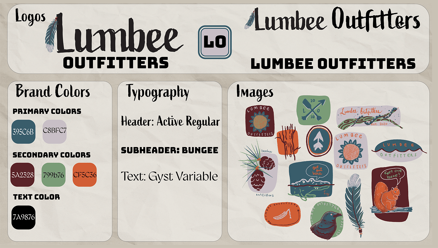
“Lumbee Outfitters Rebrand”—Website rebrand- DME-285: Systems Project
Lumbee Outfitters is a small outdoor apparel brand based in Pembroke, NC. Pembroke is the home of the Lumbee Tribe and can be found right along the Lumber river, from which the tribe gets its name. The small business began in 2020 and felt it was time for a refresh. New graphic elements for apparel were requested, along with a more user-friendly experience for customers on their website.
Lumbees are the People of the Dark Water, surrounded by low lying swamplands and a winding river. I wanted the color palette to have an outdoorsy, slightly rustic feel. The muted blue and cool gray are complemented by the warmth of the orange and brownish-red color–reminiscent of the red clay of the Lumber. An airy sage green ties the palette together. The graphic elements designed on Procreate have a natural theme, depicting the flora and fauna of the area. There are also nods to the Lumbee culture with the arrows, feathers, and canoes. I played around with an alternate, more feminine color palette as well. Overall, the graphics capture the appreciation of the outdoors Lumbee Outfitters promotes.


